Infographic
Tell the story of complex data simply, through visual language.
It's easier to remember visuals than text. Infographics are visual representations designed to make complex information easier to understand. Strong infographics make dry facts engaging and persuasive. Journalists, marketers, scientists, and others use them to visualize data, processes, and research findings. Infographics can include pictures, diagrams, graphs, tables, maps, lists, timelines, flowcharts, and more. In this project you will gather quantitative data on a research topic of your choice. You will then choose an infographic format that best tells the story of that data and share your work online.
Piktochart- Data
- Graphics
- Storytelling
Learning Goals
After you finish this activity you will be able to:
- Gather quantitative data on a research topic of your choice
- Select the appropriate infographic genre to tell your data's story
- Create an infographic to share online
Follow these steps to complete the project.
To track your progress, click each step as you finish.
An excellent first step in creating any media work is to examine exemplary works of the same type. Make a list for yourself of what makes these examples strong and inspiring.
Don't skip this step!
| 1 | Get inspired by visiting the links in the Get Inspired box. |
By growing your skills in the tools used in any project, you save yourself time and produce stronger work.
| 2 | Peruse any or all of the tutorials in the Tame Your Tools box. |
When beginning a new media project, it's best to organize your resources in a single location.
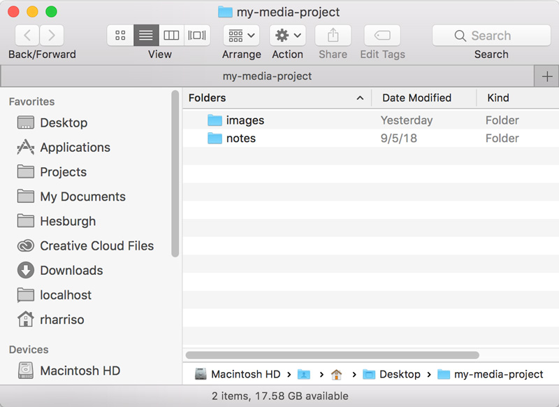
| 3 | Create a folder on your Desktop named something memorable, such as my-media-project. In this folder you'll organize all your resources for this project. |
| 4 | Create a subfolder in your project folder called notes. Use this for storing any research notes or links you capture during your research. |
| 5 | Create a subfolder in your project folder called images. Use this for storing any icons, images, or other visual resources you may wish to use in your infographic. |
Alternate File Storage
You may also organize your documents in cloud storage, such as Box or Google Drive.
Quantitative data is the hallmark of most successful infographics. The research phase will help you clearly focus your infographic around specific data. Start by identifying a subject area you are interested in researching, and focus on a specific problem or issue you feel needs more public attention.
| 6 | Once you've identified a specific issue or problem, gather as much quantitative data as you can on its causes and effects. There are a wide range of data sources to draw from. The University of Missouri provides a list of common public use datasets. |
| 7 | If you are new to using datasets, consider consulting a subject librarian for help in gathering data on your subject. |
| 8 | Finally, you may wish to use Google's Dataset Search engine, which aggregates datasets from a wide range of data repositories: |
| 9 | Make sure to save all your research notes to your notes subfolder. |
In this step, you'll marshall your data to create a rough sketch, experimenting with organizing the chunks of information in different layouts.
| 10 | Review the Infographic Quality Checklist for a list of best practices. |
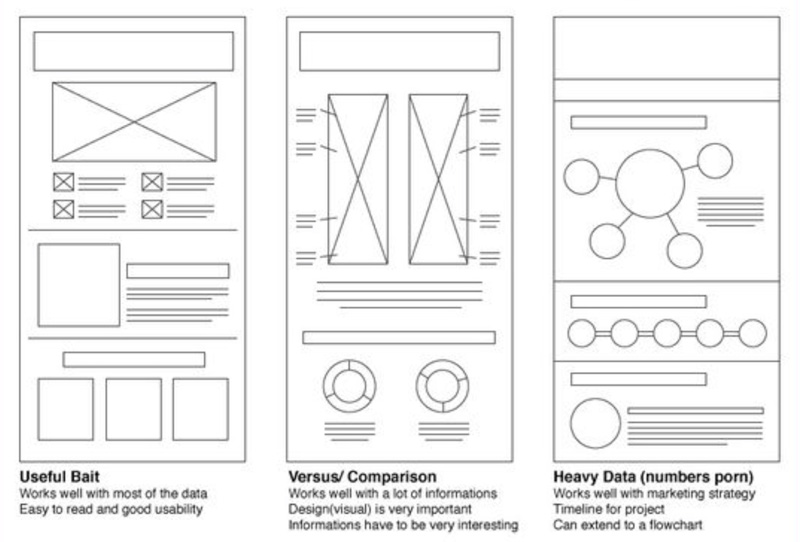
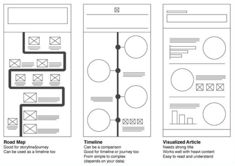
| 11 | Review the Infographic Layout Cheat Sheet for a few ideas on designing your page. There are many more examples of page design to be found by Searching Pinterest for 'infographics'. |
| 12 | From your research, identify the chunks of information that you want to include, such as charts, graphics, text, etc. For each chunk, create a rough drawing or short description on a sticky note or 3x5 card. Lay out the cards, arranging them in different ways and editing them if necessary. What image or relationship among the data emerges as you arrange the cards? |
| 13 | Next, try to identify a metaphor to use in organizing your data—perhaps a zoo, a game, a highway, or even a symphony. For example, if your topic involved wilderness ecology, you might structure your data along a mountain trail that leads from the base (least green compliant practices) to the peak (best practices in green ecology). |
| 14 | Take a picture of each unique wireframe you come up with using a camera or mobile phone. Make sure to save each unique wirefame to your images subfolder. |
Once you settle on a metaphor and page structure, it's time to choose a color scheme and to gather illustrations, graphics, and icons to combine with your data to help tell the story.
| 15 | Search Vexels and Flaticon for vector graphics. |
| 16 | Search Pixabay and Unsplash for images. While photographs are not typical to infographics you can create vector illustrations from photographs with Adobe Illustrator's image trace tool. See Tame Your Tools for a tutorial on tracing. |
| 17 | Make sure to save any illustrations, graphics, or icons you intend to use in your images subfolder. |
| 18 | Create a Google Doc under your Notre Dame Google account and credit any authors whose resources require attribution. Something like the following is usually sufficient: |
"Quality" icon made by Freepik from flaticon.com/free-icon/quality_272366.
There are many software applications with which you might create your infographic. We'll use the cloud-based Piktochart, which offers infographic tools and templates and an easy way to share your work with others.
| 19 |
Sign in to Piktochart using your Notre Dame Google account. |
| 20 |
Click the button. |

| 21 |
Select . |
| 22 |
from a blank template. |

With a blank canvas open in Piktochart, you'll now transform your wireframe into a real infographic.
Auto-saving
No need to save in Piktochart. Your design is automatically saved after each change.
| 23 |
Before you begin, click the at bottom left to take a tour of the interface. |
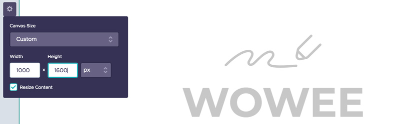
| 24 |
Now, click the and set your canvas size. A width of 1000 pixels and height of 1600 pixels creates an image that will print nicely on 11" x 17" paper. |
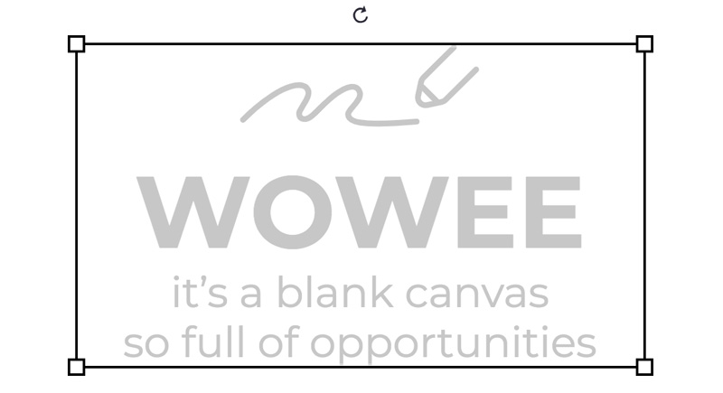
| 25 |
Select the "Wowee" starter box. You should see rectangles at the four corners, once selected. Press delete on your keyboard to remove it from your canvas. |
| 26 |
Next, Select from the side menu and set your background color. You may also apply a pattern and set its opacity. Remember: contrast is the key! Use a light color if your content is dark, and vice-versa. |
| 27 |
Select from the side menu and add your titles and text boxes. Remember: keep text to a minimum. Favor short phrases and lists over full paragraphs. |
| 28 |
Select to add Shapes and Icons and Lines. You may add Photos and Photo Frames, though these are not typical of infographics. |
| 29 |
Now select from the side menu and upload any images you may have collected outside of Piktochart. These should be found inside your images subfolder. |
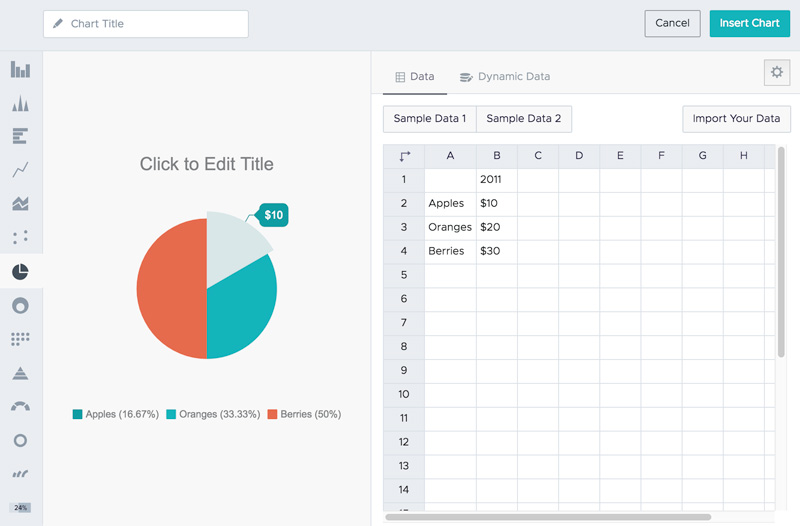
Charts and maps often make up the bulk of an infographic. In this step you'll add any maps or charts you've created from the datasets you gathered.
| 30 |
Select from the side menu. Select the icon. Select your specific chart type at left. Add your data at right. When you are finished customizing your chart, click the button. For a tutorial on working with charts, see the Tame Your Tools box. |
| 31 |
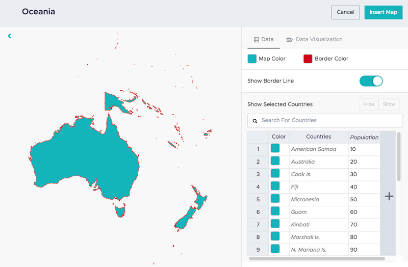
Select from the side menu. Select the icon. Select a specific map and click to add your data. When you are finished customizing your map, click the button. For a tutorial on working with maps, see the Tame Your Tools box. |
To be authoritative, it is important for any infographic to cite the sources of its quantitative data. Typically you will post these resources online for interested parties to review.
| 32 | Create a Google Doc under your Notre Dame Google Account. If your data is primarily spreadsheet data, you may wish to create a Google Sheet instead (or in addition). |
| 33 | Copy the supporting data for each chunk of data you use in your Infographic into your Google Doc or Sheet, and correctly cite the source. |
| 34 | Share your Google document(s) publicly. See Tame Your Tools for information on sharing Google documents. |
| 35 | Make sure to paste the link to your Google Doc into the footer text of your infographic. |
Because an infographic is an implied call to action, you'll share your infographic on the Web for others to see.
| 36 |
Click the icon to edit your infographic name. |

| 37 |
Click the icon to share your infographic. |

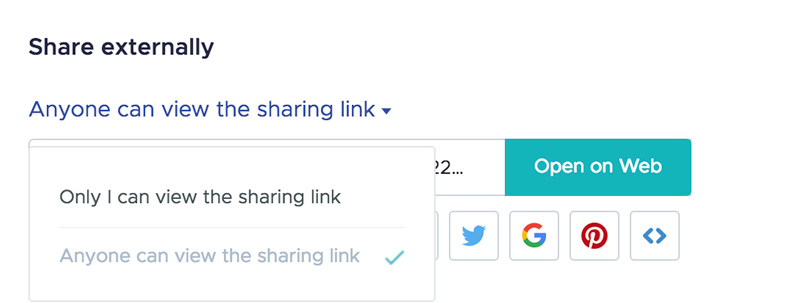
| 38 |
Click the and select Anyone can view the sharing link to share your infographic. |
Congratulations!
You've grown your multimedia literacy while creating cool things! Well done, you!
You might consider nominating work you are proud of to the Remix Project Showcase!

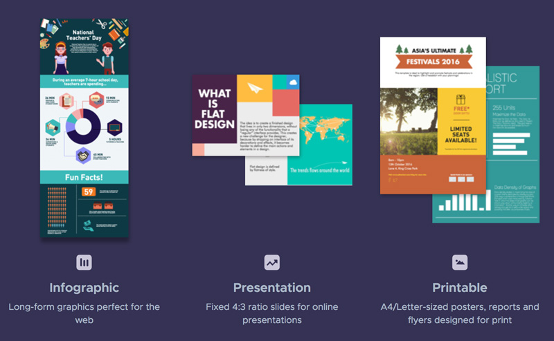
Example
Get Inspired
Explore examples of similar projects.
Tame Your Tools
Master the skills used in this project.
Get Help
Notre Dame has many helpful resources, including our Media Corps coaching staff, located in the Hesburgh Library.
Give Feedback
Remix is continually evolving. Please help us improve by providing feedback on this project or any other feature of Remix.